

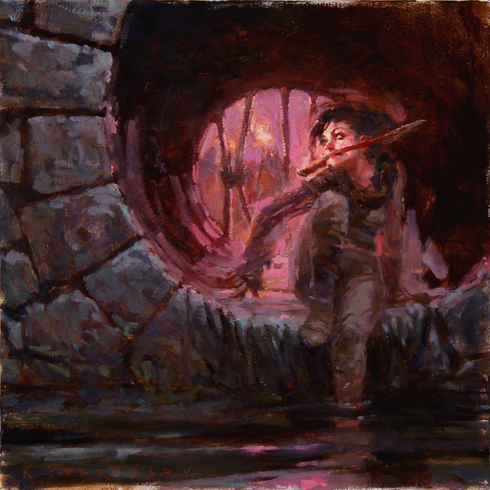
So, as you can see, I'm trying to paint this in oils. Which is considerably more time consuming so far.

what do you think?

Color roughness. WHY does it look so cheesy? Maybe the blue-orange is the origin of the cheese smell. help me guys I'm trying to sell out.

11 comments:
HOT!really nice mood, but the background is crap.. i would loose the contrast and color in the background, plus if youre gonna sell out do it bigtime!@
Love the mood as well. I am more concerned about her left arm. With her left shoulder up, it feels like her left arm should be the supporting arm or the arm with some action. Either way, it feels like an important information you haven't put down yet.
No sure if how you planed to finish that arm.
Sweet painting. I actualy like the colors. It's a good idea to darken the bg to create more depth and ad more attention to the girl. Maybe you could push back even more. Careful The cross shaped bare on the back doesn't work. it is really distracting the whole design.
Push the information on the girl. Her right knee need more attention. Her left arm is to close in value to the torso, it's really confusing and doesn't create a nice silhouette. Et cetera...
imho I tend to like the first version better.
I would almost suggest the opposite of some of the other comments, I am a fan of high contrast. I'd almost boost the backgound light and let it bleed over the girl a bit, this would add some more mystery/mood. Also it would cut out some of the scratchy crappy ifo in some of the areas...simplify.
nice coloring work! Love the other paintings as well!
Nice painting work here!
beatiful paintings, love the atmosphere.
Muchas gracias por todo! tanto por tu comentario como por el consejo de echar un ojo a ese pedazo de dibujante!.
Tu blog es increible, está lleno de un material extraordinario.
really like the feel to these. great concept. I tend to lean towards the top one. great work and nice blog.
I'm with Todd -diggin the top one.
I think it's a simple, yet really effective composition. Great stuff - would love to see more oils :)
I want all of them!!!! Cool!!!!
Bonito, bonito, bonito!!!
Post a Comment